In this essay, I’ll talk about a powerful visualization called choropleths, why they’re horrendous to reproduce, and how we can empower data scientists to build and use them more intelligently.
Update: My professor and advisor recently launched a company, Ponder, to make Pandas both scalable and intelligent. See my work on geographic types embodied here.
It’s hot
It’s hot in California. No, like really hot. If you’re from the West Coast, this isn’t news to you—you were born and raised in the ever-increasing heat. If you aren’t and you live in the US, you’ve likely seen an elaborate map on the news like this (Source):
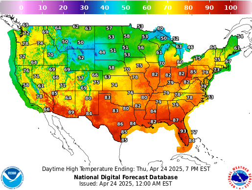
While this diagram is modest in size, it paints a clear picture of how temperature today varies by geographic location in the US. The main component of this diagram is a choropleth, where choros means ‘region’ and plethos means ‘multitude’ in Greek.
Data scientists commonly find choropleth maps useful because
- readers can easily visualize how a statistical value, like temperature or per capita income, varies across a geographic area and
- published statistical data (e.g., government census, Kaggle datasets) are typically aggregated into well-known geographic units, like state or country.
Can we reproduce this?
Choropleths, however, lack reproducibility. According to this tutorial, data scientists have to
- Properly install a package like Geopandas
- Load in their dataset as a CSV
- Load in a separate map dataset
- Clean their dataset so that it matches the package’s desired format
- Project their dataset onto the map
- Plot the dataset with a library like Matplotlib (if you’re new to Matplotlib, this takes a while)
- Add a legend, title, axis labels, and supporting annotations
- Export the resulting map to share with their colleagues
- Repeat the same process for other statistical variables or geographic regions
Nothing about this process is sexy, especially the monstrous amount of code you get at the end (~50 lines).
Furthermore, a data scientist doesn’t pinpoint interesting visualizations as soon as she receives a new dataset. The process of identifying meaningful relationships in data requires maturity in statistics, domain knowledge, and tons of trial and error with differing combinations of variables. The 50 lines of cumbersome “boilerplate” code needed to produce a single choropleth significantly slows the latter point in her analysis. As a result, she will either spend too much time building choropleths for different sets of variables or, even worse, run out of time and settle for a less meaningful visualization.
Intelligent automation for geographical relationships
The above description hints at the exact problem Lux aims to solve.
Lux is a Python library that facilitates fast and easy data exploration by automating the visualization and data analysis process (paper | code | docs).
Data scientists can print out their Pandas dataframe on Jupyter and Lux will automatically recommend a “set of visualizations highlighting interesting trends and patterns in the dataset.”
With this context in place, we’re now ready to dive into the technical solution and how I arrived at it.
Problem: Data scientists need automated support for geographical relationships in their datasets.
Solution: My goal was to build a new automation for 1) detecting geographic attributes in a dataframe and 2) rendering choropleth projections sorted by their “interestingness”.
Type inference for dataframes
Lux performs type inference for each column of a dataframe. For example, Lux considers a column temporal if its values are timestamps or datetime instances. As a result, Lux will construct run charts to help data scientists perform rapid time series analysis and forecasting.
I extended Lux’s type inference system by considering a column geographical if its name corresponds to a cartographic unit like “state” or “country” and its values are nominal. When Lux parses a dataframe, it will detect geographic attributes and couple them with quantitative variables. For more information on how Lux processes dataframes internally, please refer to our architecture documentation.
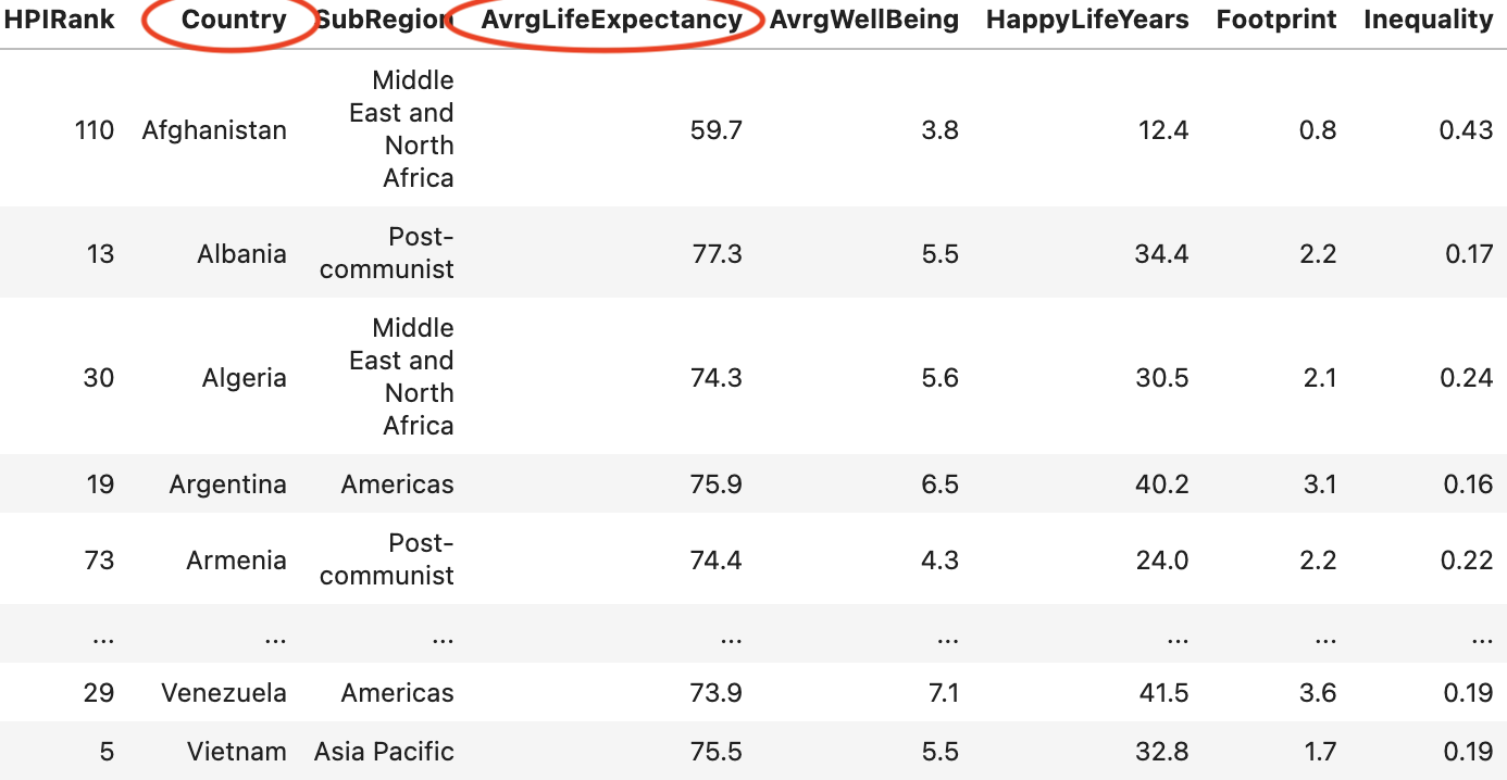
From there, Lux feeds our annotated dataframe into our visualization renderer. I created a class called Choropleth.py which handles the projection mapping, plotting, and code generation all in one place. Let’s summarize what my class does with an example. Suppose Lux detects that our dataset has both a country column and a quantitative column representing average life expectancy, denoted as avgLifeExpectancy:
- Mapping technologies use ISO 3166 country codes to designate every country and its subdivisions. We’ll first need to apply a lookup operation to convert each country label into its corresponding country code. I used iso3166, a lightweight (30 kb) and self-contained (no dependencies) module, which provides a mapping from country names to their ISO codes. This step can be summarized as follows:
from iso3166 import countries
...
df['country'].apply(lambda x: countries.get(x).numeric)
- Next, we need to extract and project the data onto the world map. As we look up our data, we’ll aggregate by a country’s
avgLifeExpectancyand encode a color scheme based on our results. This step can be summarized as follows:
feature_extractor = alt.topo_feature(Choropleth.world_url, feature="countries")

chart = (
	alt.Chart(feature_extractor)
	.mark_geoshape()
	.encode(
		color=f"avgLifeExpectancy:Q",
	)
	.transform_lookup(
		lookup="id",
		from=alt.LookupData(df, "country", "avgLifeExpectancy"),
	)
	.project(type="equirectangular")
)
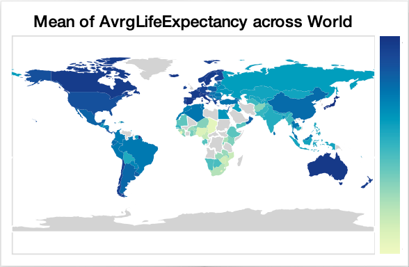
The end result for our example looks like the following:
I’ve glossed over this section, as the detailed solution gets quite technical. If you’re curious about the code, take a look. Now, when we print out a dataframe, we can see a new tab that displays our geographic columns paired with the dataframe’s quantitative variables:
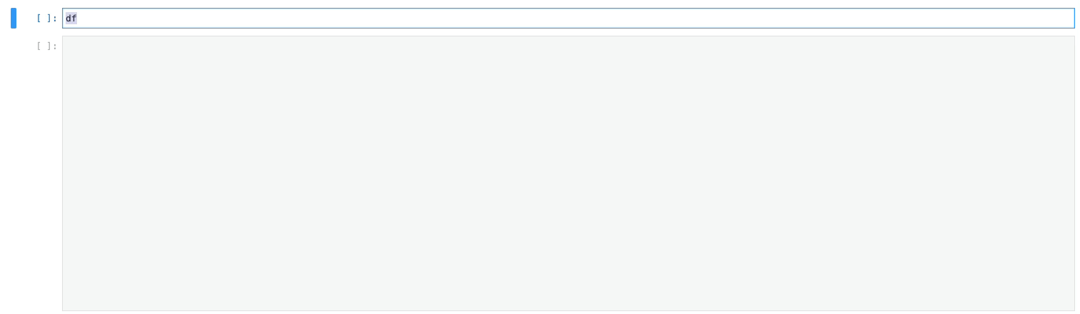
Congrats, we just abstracted away all nine steps without the end-users needing to write a single line of code relating to choropleth mapping.
Building upon Primitives
Last week, my friend Brian and I had an insightful conversation about primitives. Every good programming language has a set of guiding primitives that are central to the programmer’s goals. Here are some examples:
- HTML’s core primitive is the HTML node, and the HTML node is a clean abstraction layer over the Document Object Model (DOM). This primitive makes HTML an ideal markup language for creating static documents in a web browser.
- SwiftUI’s core primitives in UIKit, like UIViews and UIControls, make it incredibly intuitive to design and program iOS applications at the same time.
- Node’s core primitives are asynchronous events, enabling developers to handle large amounts of connections in a non-blocking manner.
- Ray’s actor model makes it seamless to instantiate and manage remote workers.
- Lux’s type inference system empowers data scientists to rapidly explore unstructured data.
The list goes on. These primitives should be analogous to eigenvectors. Geometrically, eigenvectors represent the principal axes of some n-dimensional space. They’re powerful because we can break down any linear transformation to a set of independent operations on our eigenvectors. Similarly, the primitives of a programming language should act as the principal axes of a developer’s needs. They should be powerful enough to break down any user problem into a set of independent operations on those primitives.